Josh Terry
is a
UX Designer
&
Game Programmer
who empowers people with great experiences.
He's a former Sr. UX Designer and Sr. Software Engineer at
Anduril
, and a former Game Producer and UX Designer with
36 published titles
. He graduated from
Georgia Tech's M.S. HCI
program with a
4.0
GPA.
Recent Work
An ALTIUS 600 drone in front of NOAA's P3, Kermit.
ALTIUS Hurricane Hunter UI
I researched, designed, and engineered the AOML Gold Medal awarded command & control software used to fly ALTIUS 600 into Hurricane Ian.
2023 - Anduril Industries
Product Ownership

User-Centered Design

Info Available Upon Request
An ipad with a dashboard for monitoring sea otter health, and two prototypes of computer-instrumented toys for monitoring otter health.
Marine Mammal Health Informatics
I developed the first-ever platform for quantifying and tracking anomalies in marine mammal behavior through enrichment with Georgia Aquarium.
2022 - Georgia Institute of Technology
Interaction Design

Rapid and Functional Prototyping

Animal Computer Interaction
Problem Space
Helping the mammal and bird team at Georgia Aquarium care for their Southern Sea Otters as effectively as possible during the COVID-19 pandemic.
Background
In CS 8803: Animal-Computer Interaction, an elective I took and was later lead TA for during my time in Georgia Tech's MS Human-Computer Interaction program, each student in the class was asked to come up with an idea to complete as a semester-long project. The one criteria for the project was that it must somehow involve animals interacting with computers.
Since I'm totally obsessed with otters, I decided to do something with them, and I reached out to Lisa Hoopes, the Director of Research at Georgia Aquarium. Several meetings, 5 hours of training, and 80 pages of ethics documentation later, I had onboarded with Georgia Aquarium's IACUC and established a plan forward with their mammal and bird team.
Extremely little formal research on sea otters' interactions with technology exists, so most of the background research I drew on for this project involved enrichment for marine mammals in zoos and aquariums, as well as research on working dogs' interactions with technology. Two "backronyms" I considered for this project are SOFT (Sea Otter Foraging Tech) and MMBOP (Marine Mammal Behavior Observation Platform). Ultimately, I settled on Marine Mammal Health Informatics Platform as it most accurately encapsulates the project space.
Mustelids, including Southern Sea Otters, are extremely susceptible to COVID-19, and at the time of this project, the otters at Georgia Aquarium had not yet been vaccinated for COVID-19, and the Asian Small Clawed Otters at the aquarium had already fallen sick with COVID. As a result, a way to quantify and track the health of the Southern Sea Otters at Georgia Aquarium could prove invaluable for keeping them healthy and preventing the spread of COVID-19 within the aquarium's otter population. Like many other prey animals, Southern Sea Otters evolved to hide when they are feeling unwell by not acting any differently to avoid being picked off by predators. By establishing a baseline in the animals' behavior, we will likely be able to identify health concerns before they are visible to the naked eye.
Research
Prior to designing and iterating on possible solutions for this problem space, I performed seven early research activities to establish project requirements and to better understand my stakeholders, including trainers, curators, veterinarians, managers, visitors, and the sea otters themselves. These activities included:
I. Semi-structured interviews with four trainers and one associate curator on the mammal and bird team to learn about the trainers, the otters, and the aquarium. These consisted of around 15 open-ended questions, and I would often ask "could you tell me more about that?" when I felt it necessary to gather more information from participants.

II. User-Value Ranking of different project spaces with the trainers and curator interviewed. I asked participants to rank their choices in project space first by how interested they were in each project space, and then by how strongly they felt the aquarium would benefit from a project in that space.

III. Data Visualization of the above user-value ranking results that would later be presented to the entire mammal and bird team when deciding next steps in what specific project idea to pursue.

IV. Observation of the sea otters both on display and in back of house in their habitat to better understand how they interact with toys. This also helped me gain an understanding of where aquarium visitors spent most of their time, and what they did while viewing or passing by the sea otters.

V. Usability Testing of Low-Fidelity Prototypes of otter toys. By designing unconventional enrichment devices for the otters, I seeked to discover how they interacted with novel and unfamiliar enrichment devices.

VI. Data Visualization of the above low-fidelity prototype testing sessions to present to stakeholders and provide evidence for which next steps we should take when designing physical prototypes.

VII. One Participatory Design Session with the entire mammal and bird team to establish for sure which project space would be most beneficial to hone in on in the second semester of the project.
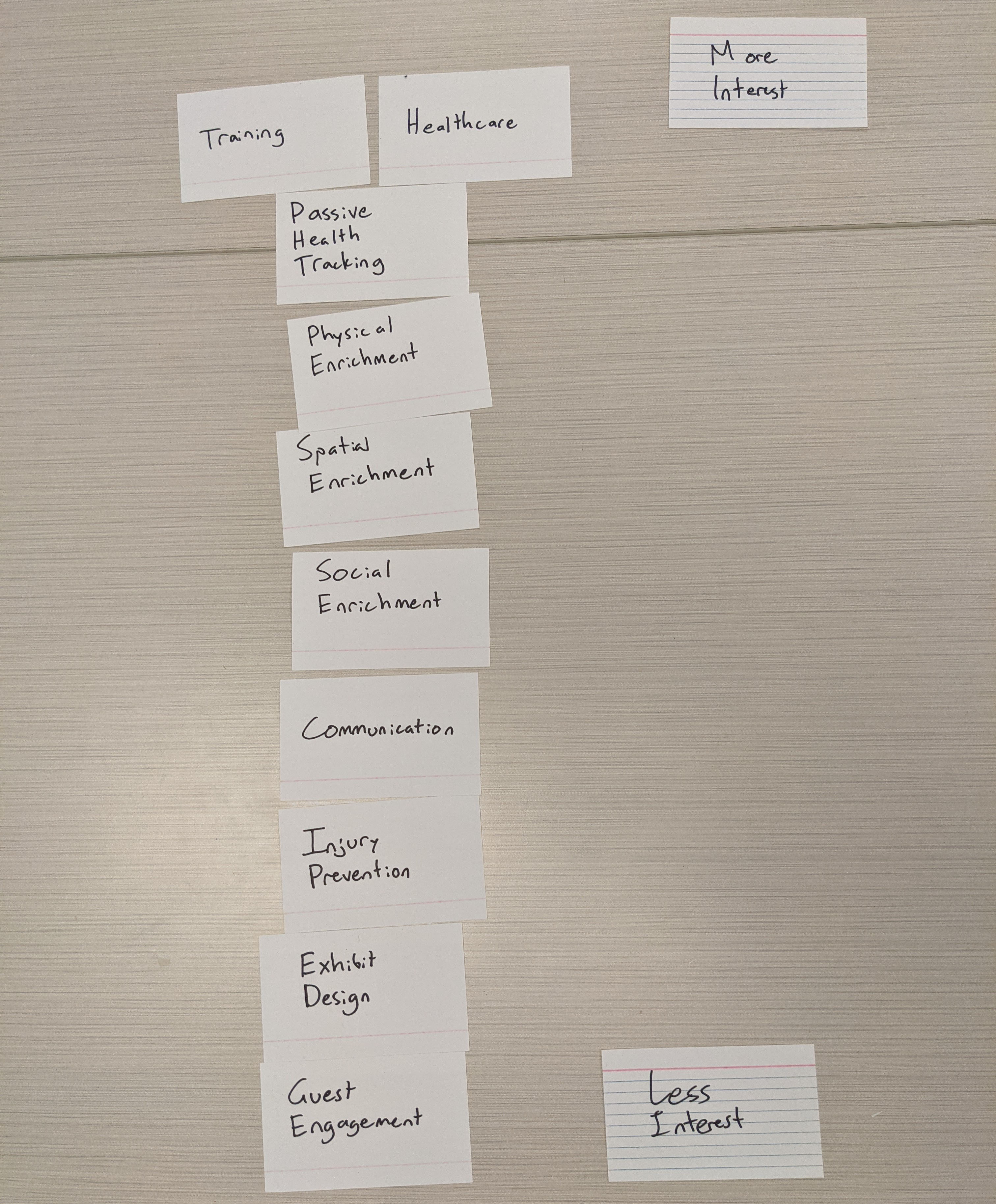
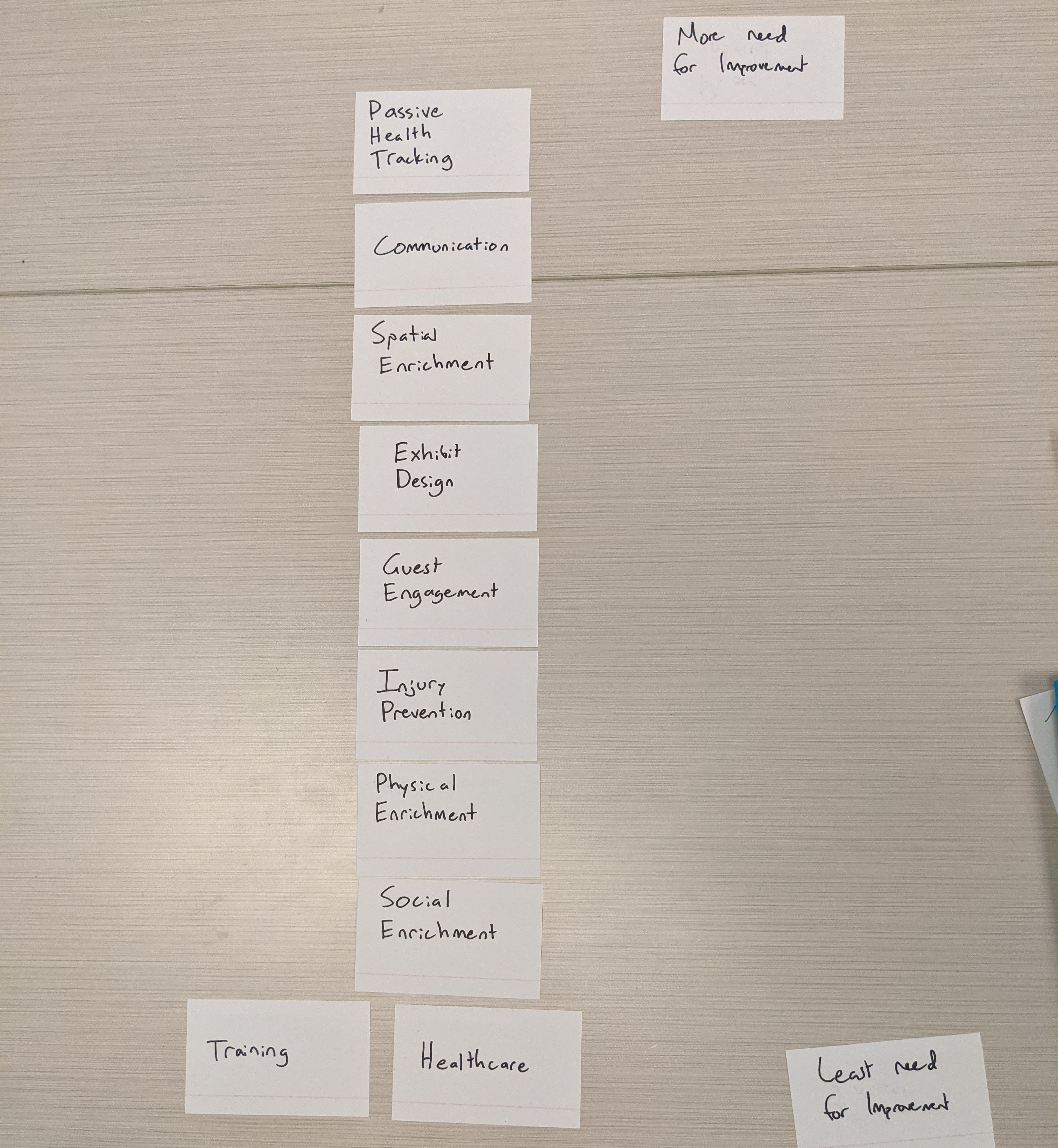
user value ranking results of how interested a trainer was in a project space.user value ranking results of how much a trainer felt an aquarium needed things in place
The above images are photos taken from one participant's user-value ranking session. Some project topics, such as training and healthcare, were interesting but not needed. Some project topics, such as exhibit design and guest engagement, were fairly needed but not interesting. And some project spaces, such as passive health tracking and spatial enrichment, were both fairly interesting and needed in this trainer's opinion.

I then normalized these findings on a scale from 0 to 1 for each trainer, and averaged those results in the below graphs.
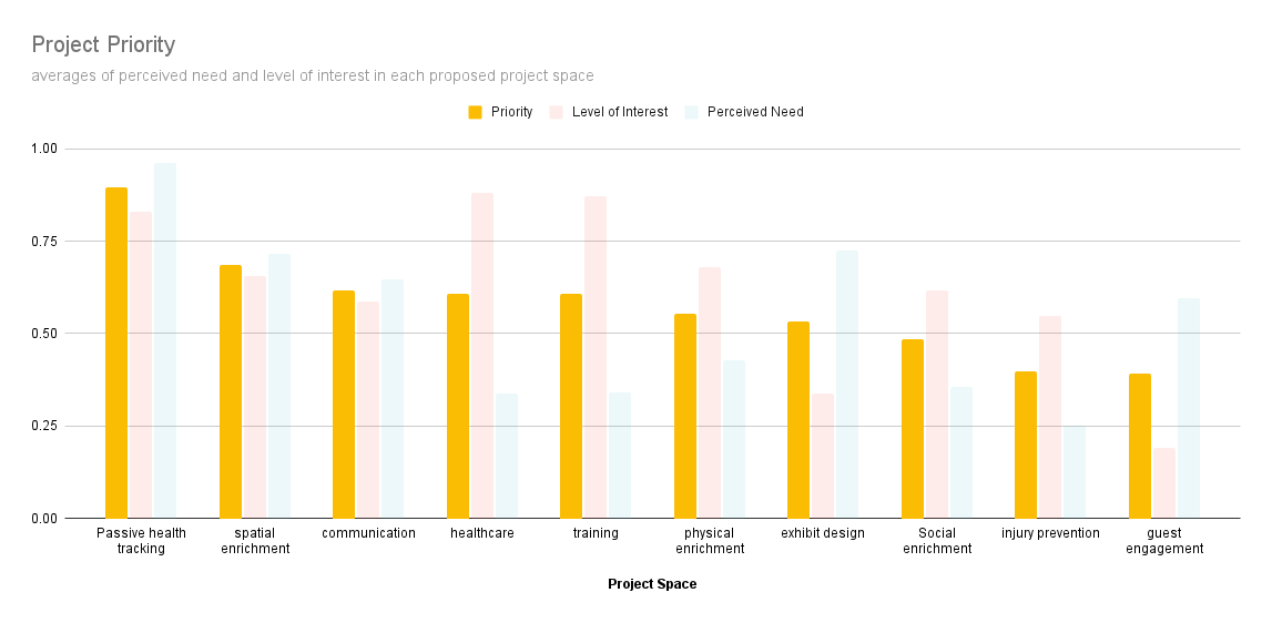
A graph depicting how interested otter trainers were in certain projects. Healthcare and training rank highest, while exhibit design and guest engagement rank lowest.A graph depicting how strongly sea otter trainers felt the Georgia Aquarium needed certain things. Passive health tracking and Exhibit design rank highest while healthcare and injury prevention rank lowest.
A graph depicting the averages of the level of interest and perceived need graphs. Passive health tracking and spatial enrichment rank highest while injury prevention and guest engagement rank lowest.
I generated graphs with the averages of each participant's responses normalized between 0 and 1 to better understand how trainers and curators felt about each project space. Based on the lowest graph above, passive health tracking and spatial enrichment were both the most interesting and most potentially beneficial to the sea otters of all of the projects proposed.
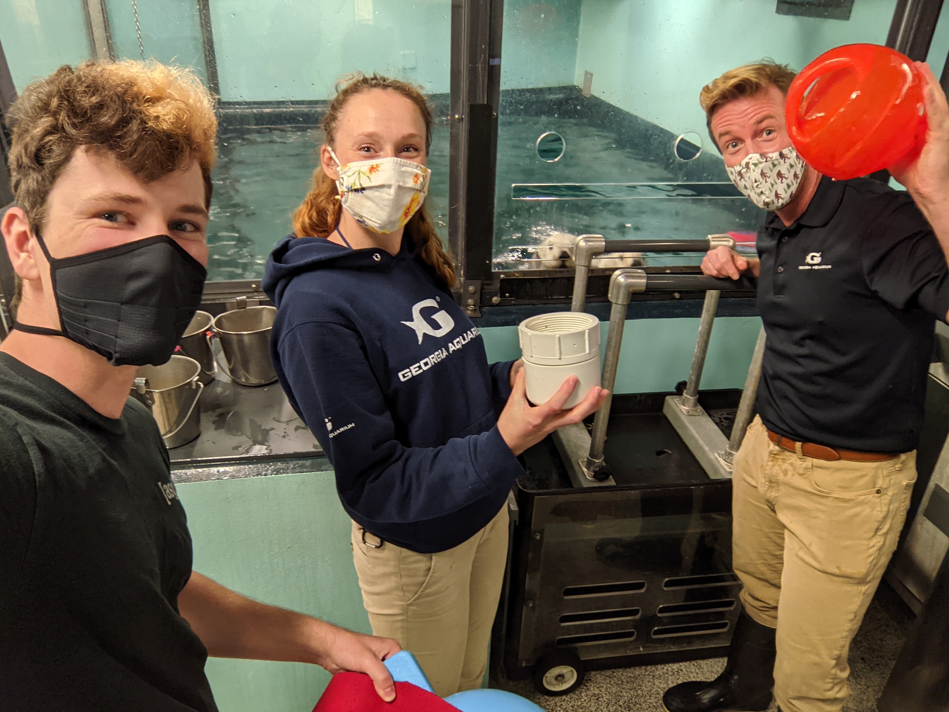
An image of Josh and two otter trainers posing with three prototypes: the kelp toy, the orange toy, and the white open toy. Two otters are peeking up in the background.
To gain a better understanding of what sea otters perceive as signifiers and affordances within the context of enrichment devices, and to inform the design of future high-fidelity prototypes, I designed, built, and tested four low-fidelity prototypes for the five sea otters to play with across two sessions for a total of 40 trials. These devices were unique in that they were all novel to the animals, they all had food secured in them in different ways, and they all required modes of interaction rather than smashing or biting to retrieve food.
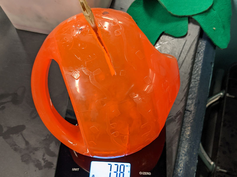
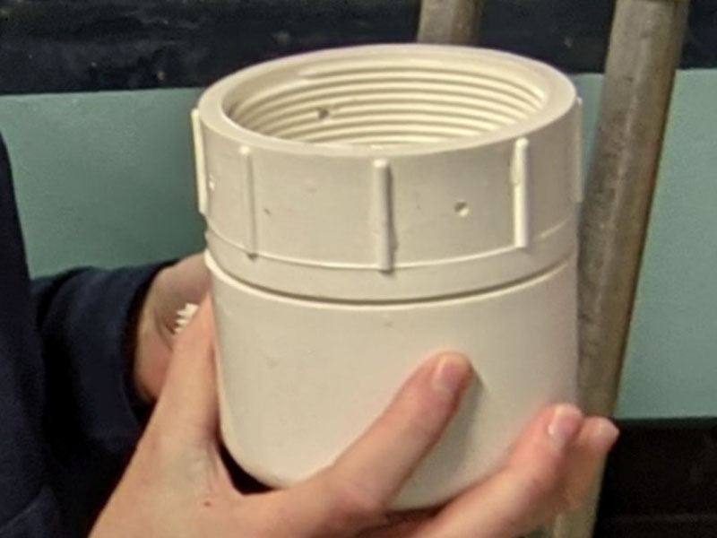
orange prototype toyA white prototype made of PVC. It is roughly the size and shape of a wine tumbler.
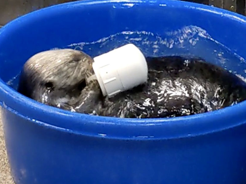
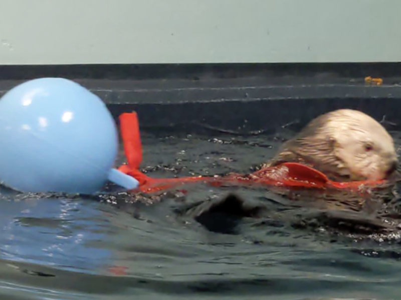
an otter playing with a closed white pvc toyAn otter in water pulling a jolly ball by a strip of kelp.
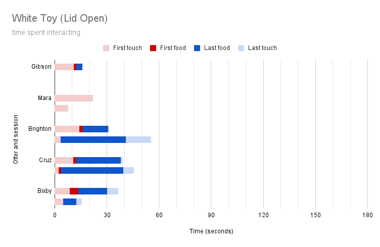
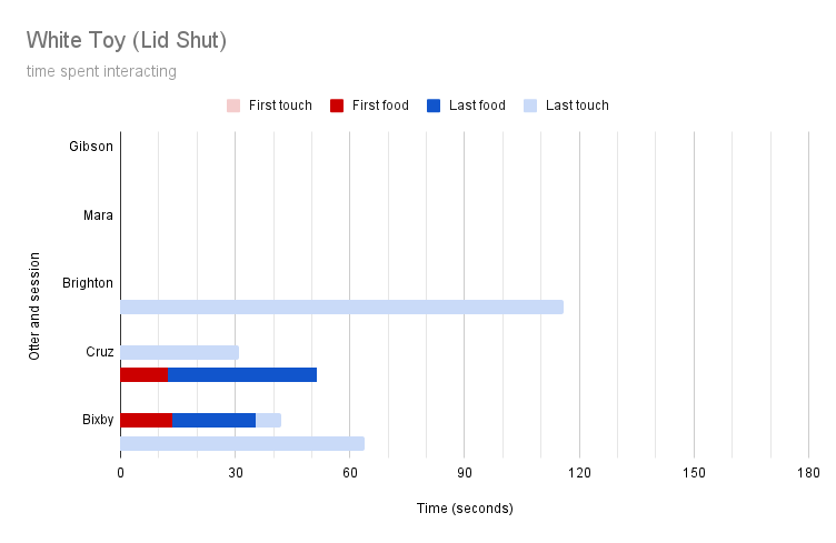
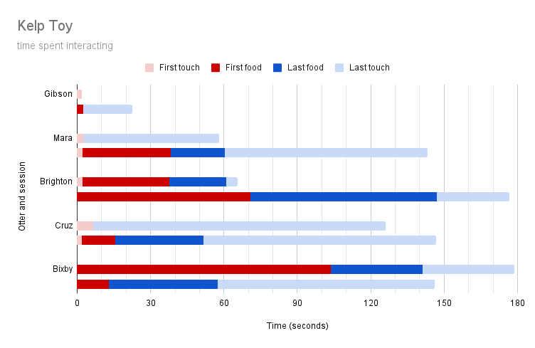
The above four images are the four low-fidelity prototypes that I used to identify how sea otters understand and interact with toys. These prototypes were an orange toy with a slit that could be opened by pressing, a white open toy that food could be retrieved from by grabbing, a white closed toy that needed to be unscrewed to be opened, and a kelp toy with food tied in a square knot at the end of a piece of car wash felt tied to a jolly ball. In these usability testing sessions, otters were presented with a toy stuffed with food. Sessions were timed and recorded, and certain key moments during these sessions were marked and visualized: first touch (when the otter first touched the toy), first food (when the otter first begins retrieving food from the toy), last food (when the otter stops getting food from the toy or the toy no longer has food in it), and last touch (when the otter stops touching the toy).
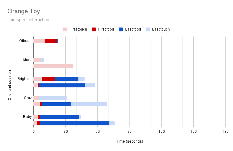
graph showing otter interactions with orange toy
graph showing otter interactions with white open toy
graph showing otter interactions with white closed toygraph showing otter interactions with kelp toy
From the above low-fidelity prototype testing sessions, I derived eight key takeaways:

I. The kelp toy was most effective at soliciting interactions from the sea otters, but that is not necessarily indicative of the prototype being most effective for health tracking, as ideally the sea otters will want to give the toy back to trainers in exchange for food. Furthermore, the kelp toy would by far be the most complex to instrument with computational elements and maintain for prolonged use by a nontechnical audience without the regular intervention of technical experts. Therefore, this design would not be effective in the long run.

II. Gibson and Mara were anxious about new enrichment devices, but they gradually warmed up to the kelp toy across the two different sessions. In combination with feedback from trainers that these two sea otters were the youngest and could do with desensitization to new enrichment devices, we can assume that they would similarly warm up to other new enrichment devices over time.

III. None of the otters were able to retreive all of the food from the orange toy. While all but one of them were able to retreive some amount of food from it, they did not learn during the 40 sessions how to press the toy to empty it of all of its held food. The sea otters also did not exhibit any measurable banging, smashing, or biting behaviors on the toy; therefore, similar to the kelp toy, this design would not be effective in the long run.

IV. The white open toy was the quickest for the sea otters to interact with, and they were able to retreive the food from it with relatively little difficulty. However, similar to the orange toy, they did not exhibit any measurable smashing, banging, or biting interactions on the toy, so this would not be effective in the long run.

V. The white closed toy solicited the most measurable behaviors from the sea otters (smashing, banging, biting, grabbing), but Gibson, Mara, and Brighton were somewhat nervous around the toy and did not exhibit many interactions. Since the otters warm up to new enrichment devices over time, and since this device encouraged otters to exhibit the most measurable behaviors, I designed future prototypes with this mode of interaction in mind.

VI. Otters assume food will be in the center of mass of a toy. When given the kelp prototype, they all began to search for food by looking at the jolly ball rather than the square knot of kelp containing food. Therefore, the final prototype should have food in its center.

VII. Otters look to any openings in toys for food first. When looking at toys, they will aim to spend as little energy as possible retreiving food from it, which often means reaching into any openings in the toy to search for food. Therefore, the final prototype should have some opening in it that is large enough to visibly indicate the presence of food, but small enough for otters to not be able to simply reach in and grab the food. Alternatively, the final prototype could be designed to be packed densely with snow to form a plug, preventing otters from just reaching in and grabbing the food.

VIII. If an otter thinks food is in something but cannot see that food, it will attempt to smash it open. This occurred with all of the prototypes except for the white open toy. Therefore, the final prototype should be designed in such a way that signifies the presence of food to the otters, but does not have food immediately ready for the taking. The prior point of stuffing the toy with food and snow to form a plug would be an effective means of accomplishing this.
Participatory Design
Given all of the above activities and findings, I drafted and pitched eight project ideas to the mammal and bird team at Georgia Aquarium to help them better care for their Sea Otters. The project ideas below each directly relate to at least one of the proposed project spaces, and they were all presented to the entire sea otter team for feedback. In a participatory design session, we collaborated verbally on what idea might be best to move forward with, and ultimately decided that the best product would be a hybrid of I. Light-up Interactive Toys and IV. Behavior Tracking Platform. Due to time and budget constraints (since this was a self-funded Master's project), I focused primarily on the Behavior Tracking Platform elements for the remainder of the project.
Project Idea
Issues & Design Implications
Project Description
I. Light-up Interactive Toys
A series of sinking, food-holding toys. Only one of these toys will light up at a time, and only the one that is currently lit up will award food when picked up. Putting five or so of these in different locations throughout the habitat would encourage foraging behaviors, and provide the otters with a spatially-oriented cognitive challenge. Participants expressed that a hybrid between this and project IV. Behavior Tracking Platform would be most beneficial.
II. Opt-in Otter Care
A system for allowing the otters to choose their care. This might look like a series of buttons on a wall or surface to let trainers know that they are hungry, tired, or want to be in a different habitat. Or it might allow them to say what kind of food they want next.
III. Desensitizing Enrichment Toy
A single toy, not unlike a bop-it, that deliberately makes novel sounds, movements, and light effects that is used to desensitize younger otters to novel enrichment devices. A toy like this might be stress-inducing at first, but could possibly be used as a single device to help desensitize otters to any other similarly sized toy.
IV. Behavior Tracking Platform
A toy that measures the otters' actions taken upon it with an accelerometer and gyroscope, and a dashboard for viewing and acting upon that data. As it is shaken, it will save that shaking data for later use and analysis. A trainer may plug it into a nearby computer to read data from it and look for behavioral anomalies in otters that interact with it in order to passively track their wellbeing. Participants expressed that a hybrid between this and project I. Light-up Interactive Toys would be most beneficial.
V. Heart Monitor
A heart-rate tracking toy that trainers would ask an otter to hold for several seconds. The toy would not contain food, and the otter would be rewarded for holding the ball for several seconds. The ball would be equipped with sensors to read the otter’s heart rate (and possibly bioelectrical impedance) on the fly.
VI. Habitat Microphone
A microphone, or array of microphones, throughout the habitats to listen for sea otter vocalizations. We might train the system with machine learning to recognize the individual voice of each otter, as well as the meaning behind each vocalization (distress, excitement, etc.). This could be used to bring attention to specific events that happen overnight and may not have been noticed otherwise.
VII. The Tube
A tube that we can coax the otters into in order to more easily take biometrics (length, width, weight, heart rate, blood pressure, blood sample, temperature) without needing to use anesthesia. This could be outfitted with many sensors and training elements to make it as non-invasive and pleasant an experience as possible.
VIII. Habitat Heat Map
A series of infrared cameras connected to a computer to track where the otters are spending most of their time in the habitat. We could use an algorithm to suggest where in the habitat to place enrichment, or visualize an image to guests to show where the otters have been spending most of their time.
Wireframe Design
Given the above takeaways and solidified project direction, I began developing wireframes of a digital interface for analyzing data collected by the health-tracking toy. This dashboard should allow trainers to upload, view, and analyze data on their sea otters, and it should allow trainers to report potential health concerns to management and on-site veterinarians at a moment's notice. The dashboard should also be usable within the context of back-of-house in the sea otter habitat, and it should be minimally obtrustive to the otter team's day-to-day functions. To satisfy these requirements, I designed the dashboard for use on a wall-mounted iPad Pro 12.9" in a waterproof case that can be removed from a wall and carried around to take photos or videos of the otters as needed.
otter views of dashboard sketches
First, I sketched out several potential layouts for an otter view screen. This would show a user details on an otter's most recent interactions on a toy, as well as more detailed information on a particular otter. This screen would not show in-depth information on the otter's most recent interaction, and a user would not be able to report health anomolies from this screen. The screen was designed with both landscape and portrait possibilities in mind. Ultimately sketch A most informed the layout of the final prototype.
event views of dashboard sketches
Second, I sketched out several wireframes for an event view screen. This screen would show a user all of the details of an otter's most recent interaction on a toy down to time, local extrema, sum of an interaction, difference from last interaction, and difference from average interaction. The line graph showing the difference between an otter's latest and average interaction on a toy in sketch B most informed the design of a similar graph in the final prototype.
report views of dashboard sketches
Third, I mocked up a report view screen. From this screen, a user would be able to send data and related questionairre-style information or photos to management and veterinary staff. Sketch D from this phase of wireframing most informed the "contact vet" user flow of the final prototype.
combined dashboard sketch
Next, I realized that the most functional approach to this dashboard would not require a user to navigate between different tabs for different degrees of functionality: all of the information a user might want on an otter should be presented to them at a glance, and they should be able to access any information on other otters with at most one tap on the screen. To best meet my audience's wants and needs, I designed a landscape-style dashboard that constantly displays an otter's health information, latest data, average data, and whether or not that otter might have a health concern to viewers. From this multifunctional tab-based overview, a user can see all information on an otter or tap on another otter's tab to view all information on that otter. From any otter's page, a user can access the platform's settings or contact vet staff.
first digital dashboard mockup on ipad
The above image shows the first interactive prototype of the dashboard, built in Figma, running on an iPad Pro 12.9". The prototype displays all information that trainers indicated would be useful (name, species, age, weight, sex, health history, medication) on a given otter, shows an otter's latest interaction and average interaction with the instrumented toy, shows an AI-generated summary on the otter's health, shows all otters as interactive openable tabs, and allows users to open settings or contact vet staff at a moment's notice.
Wireframe Evaluation
To evaluate the effectiveness of the dashboard, I had four trainers and four UX pros undergo task-based cognitive walkthroughs. Tasks included:

I.
Identify which otter is the oldest.
II. Which otter is the lightest?
III. What medications does Cersei take?
IV. Which otter might need medical attention?
V. Submit a vet report for the otter that most needs medical attention.

I followed these cognitive walkthroughs with System Usability Scale Survey Questionairres supplemented by additional unstructured interview-style questions to fill in any questions I had from their resonses to the SUS survey. The two pictures below are the results from one trainer and one UX pro's SUS surveys.
trainer sus resultsux pro sus results
From the four trainers and four UX pros interviewed, I generated the below chart depicting average responses with action items for SUS criteria most in need of intervention.
dashboard cognitive walkthrough and sus survey results: pretty good.
From the above results, I generated the four most-needed interventions to improve the design of the dashboard, shown below in Wireframe Issues.
Wireframe Issues
Issues & Design Implications
Design Implications
I. Health section meaning unclear
By renaming the Health section to History, users will more immediately recognize this section as indicating what health issues an otter has had in the past, rather than immediately assuming these are active health concerns.
II. Some participants unclear on which otter had an active health issue
I should use redundancy gain to indicate that an otter's recent behavior is anomalous through more than just color (e.g. bold text, animated icons, bold outlines on an individual). This could help call more attention to otters who are actively exhibiting a health concern.
III. Some UX pros reported that the foreground and background colors felt like they were backwards
I should swap the dashboard's foreground and background colors to more clearly highlight the information. Now the foreground is a lighter gray while the background is a darker gray.
IV. The Settings button is always the same blue color regardless of the rest of the interface, which was confusing
The settings button should be the same color as the Contact Vet button, or it should always be gray to avoid pulling the user's attention away from possible health issues in certain otters.
Wireframe Redesign
redesigned dashboard with improved visuals rendered on an ipad
By taking all of the above stakeholder feedback into account, the dashboard design is now in a state where it is ready to be implemented. This task is currently being taken on by a rising 2nd-year MS HCI student as a part of his Master's project.
Prototype Design
With well-established design requirements for the physical prototype and a fully fleshed-out dashboard to view the data gathered from that physical prototype, it's time to design the physical prototype itself. I began by examining the otters' current enrichment devices and other existing dog toys with designs similar to my end goal, such as KONG toys. I then modeled a first instrumented prototype with SOLIDWORKS, a wireframe and PLA 3D print of which are shown below.
sketch of prototype wireframefirst functional prototype 3d printed with adafruit cpx in it. this thing is crunchy and dangerous.
While the above design affords the desired interactions from sea otters, can hold food, and contains computational elements, this first instrumented prototype needed to be redesigned for several reasons. The below image shows a whiteboarding session I had with a physical prototyping instructor of mine, Noah Posner, on how to effectively redesign the toy to meet all of my design requirements.
whiteboard depicting sketches of prototype redesign for data logging and watertight electronics package
During our discussion on the shortcomings of this first instrumented prototype, we discussed the need to use a different material, the need to use sufficient datalogging internals, and the need for a housing redesigned specifically for machining and waterproofing the electronics.
Prototype Issues
Issues & Design Implications
Design Implications
I. PLA is brittle, not safe for the otters, and not waterproof
Through thorough materials research, I landed on UHMW (Ultra High Molecular Weight Polyethylene) as a housing material to be machined by hand. This material is softer than the otters' habitat's acrylic glass, so it will not scratch the glass or damage the otters' teeth, and it is harder than LDPE (Low Density Polyethylene), so it will have a greater longevity than an LDPE toy. Furthermore, this material is watertight, fairly inert, FDA-certified food safe, and easy to machine by hand.
II. Onboard computer insufficient for logging accelerometer data
Rather than using an Adafruit Circuit Playground Express with two AA batteries, I upgraded my internal components. I opted to use an Adalogger M0 feather circuitboard with a stemma-connected 6DoF IMU (inertial measurement unit) and an 8GB MicroSD card to log accelerometer and gyroscope data. Connected to this were a 5V Lithium Polymer battery and a 128x64 pixel OLED display with three face buttons for improved usability and interactivity. I programmed these components using the Arduino IDE.
III. Housing design did not keep electronics safe from saltwater
I redesigned the prototype to include a waterproof electronics package. This took the shape of a watertight housing of transparent material 3D printed on a Projet 3510 HD. To seal this housing, I designed a gasket and used four captive nuts with four 20mm M3 button-head hex machine screws. I fabricated many iterations of this gasket with both 3mm Buna-N rubber and 6mm silicone with a Cricut Maker to ensure that the electronics housing was 100% waterproof up to 10 meters deep, since the sea otter's main habitat is 8 meters deep.
IV. Designed in such a way that it could not be machined from solid material.
Given the simple rectangular shape of the electronics package, I was able to redesign the housing of the prototype to be hand-machined from a 5" diameter rod of UHMW. The housing was redesigned to be machined into three separate pieces rather than 2 so that the lip on the upper part of the prototype could be machined without the need for a bespoke machining setup.
Prototype Redesign
exploded view of all components in the final prototype design
All of the components that I were modeled in SOLIDWORKS, and each variety of component was manufactured in its own unique way. For the UHMW components, I generated drawings that I then sent to a machine shop to be made by hand, a process that I helped out with. For the electronics package, I generated STL files and 3D printed those files with a ProJet 3510 HD in Georgia Tech's Prototyping Lab. For the gaskets, I generated an AI file to be imported to Cricut's software, which I then used to cut the components from 3mm rubber and 6mm silicone. For the circuitry, I ordered components from Adafruit.com!
3d printed electronics housing containing some electronicshand holding uhmw machined prototype
The first image above depicts the base of the electronics housing when I first incorporated captive nuts into the design to allow for fine-tuning of gasket pressure. The second image above depicts the exterior of the UHMW shell when it was first machined.
oled display stating that bixby is currently being measured
While implementing the IMU datalogging functionality of the device, I decided to allow a user to select specific otters before beginning trials with the device. This information, as well as whether the device is currently active, is displayed to the user through the onboard OLED display. To save battery life and improve SD card longevity, I implemented an algorithm to write up to 16 datapoints to flash memory at a time before saving those datapoints as one bucket to the end of a CSV file aboard the SD card.
Prototype Evaluation
To evaluate the redesigned prototype, check whether the electronics package was fully waterproof, and desensitize the otters to the new object, I first gave the prototype with no computational internals to the otters. While Mara and Gibson were hesitant at first as expected, the other three otters picked up and played with the toy with no issue.
two otter trainers stuffing a prototype with food and ice
Before handing the toy to the otters, we would fill it with some food and pack it densely with ice to form a plug near the lipped top of the toy. This ice formed a plug that the otters could only open by smashing the toy against something.
brighton the sea otter playing with a prototype
Above, Brighton is smashing the food-stuffed toy against the ground to break the ice seal and get the food inside. This smashing behavior is exactly what we want to measure and log with on-board computational elements. These early trials with the high-fidelity prototype taught us that the toy's electronics package was totally water-tight, and that the otters would not try to bite the toy apart. Success! Next, we placed computational elements inside of the toy and tested the device with three of the otters, since two of them were off habitat due to some recent habitat renovations.
graphs depicting gibson's interaction with the device
Above are several visualizations of Gibson's interactions with the toy. To my knowledge, this is the first ever instance of marine mammal behavior being measured with an instrumented toy. The bottom graph is segmented into several sections based on what is going on with the toy at a given point in time. We turn the toy on, close it, stuff it with food, set it down, let Gibson interact with it, and then we open it up. Unfortunately, gibson did not pick up and smash the toy like we had hoped since he was anxious about the new object. Fortunately though, he did briefly bump against the toy around the 400 second mark of the above trial when he plucked a piece of shrimp from the top of the toy.
graph depicting gibson, mara, and brighton's interactions on the device.
We repeated the process that we did with Gibson with the other two otters in the habitat, Mara and Brighton. The lines in the above graph all start at the point during which the otters first interact with the toy, and we can already visually tell what the otters were doing to the toys. Gibson was anxious and barely touched the toy, Mara enthusiastically shook the toy and got all of the food out of it within about 140 seconds, and Brighton shook the toy so enthusiastically that the SD card came unplugged at roughly 30 seconds. Future iterations of the electronics package will take this into account and will not allow the SD card to come loose during testing. Until then, the SD card will be taped into place to ensure that it does not come unplugged. By repeating this process longitudinally for each otter, we might be able to quantify a baseline in behavior for each otter at the Georgia Aquarium and identify anomalies in that behavior to identify health concerns before they become visible to the naked eye.
Future Work
I. Implement wireless data transfer and charging. One of the main struggles during testing was the time requirement of opening and resetting the toy between trials. A way to wirelessly transfer data, start/stop recording, and charge the device would greatly improve its usability.
II. Implement dashboard functional prototype. A fully functional implementation of the digital dashboard component of the project is necessary for turning this project into a fully functional product.
III. Work with upcoming MS HCI students. Several MS HCI first year students, program faculty, lab directors, and the Georgia Aquarium have all expressed interest in continuing this project after I graduate. That said, I plan on continuing to be involved in the project while future MS HCI students and ACI (Animal-Computer Interaction) lab researchers keep moving the project forward.
IV. Get published. At the time of writing this, I am actively working on a paper to publicize the results of this first-ever study on marine mammals' interactions with computationally-driven health-tracking enrichment devices. Ideally, this paper will be published as a part of ACI Conference 2022.
V. Finalize patent. The patent for this project is currently pending, and I am actively working with Georgia Tech's licensing office to finalize it.
VI. Test with other species. The device's electronics package was designed in such a way that it could seamlessly slot into a host of any other enrichment devices for other species. Next steps for the project might involve attempting to quantify and establish a baseline for the behavior of cetaceans, pinnipeds, or sea birds at the Georgia Aquarium using similar technology.
A cell phone displaying a prototype of an accessible park-finding app. The cell phone is in a park with VR popups showing useful information.
Accessible Outdoors App
I did iterative, user-centered UX research and design on this project as the visual design specialist on a team of four MS HCI students.
2020 - Lucy Chen, Christian Gutierrez, Matt Rossman, Josh Terry
Interaction Design

UX Research

Project Management
Problem Space
Empowering persons with mobility impairments to research and engage with local parks.
Background
This project was completed during the Fall of 2020, during the COVID-19 pandemic. All user studies were conducted remotely to ensure safe social distancing, with the exception of an observation study in which team members went to local parks to conduct socially-distant research. This introduced interesting opportunities and complications to the project.
Prior to this project, all team members were unfamiliar with the social and physical caveats of working with members of the motor-impaired community. This project proved to be an excellent learning and empathy-building exercise, and all team members are now comfortable and passionate when working with this vulnerable audience.

While existing widespread navigation tools feature some accessibility settings, the accessibility information on these platforms lacks depth. Also, accessibility-oriented trail databases lack the breadth of data featured by widespread navigation tools. How do we satisfy both of these requirements?
Early Research Activities
Prior to designing and iterating on possible solutions for this problem space, we performed six research activities. These included:
I. A survey distributed to the 75 members of a support group for individuals who survived traumatic spinal cord injuries.

II. Observation of individuals at public parks during which we counted the number of people with motor impairments at those parks, as well as difficulties these individuals may have encountered navigating through these parks.

III. Unstructured interviews with members of, and experts on, the motor-impaired community and their experience engaging with the great outdoors.

IV. Affinity mapping exercises through which we hierarchically organized stakeholder remarks on the problem space and determined user needs.

V. Personas and empathy maps distilled from identified user needs and remarks to better understand and build for the end users of our product.

VI. Journey maps that provided the team with explicit user stories that our product might be used as an intervention to improve.
An affinity map of
The green "stickies" above show the four high-level takeaways from the affinity mapping exercise: users enjoyed connecting with others, being independent, appreciating nature, and overcoming the limited accessibility features present in the space.
A graphic showing the sentiment of a person as he goes on a walk that doesn't quite meet his accessibility needs.
The above journey map shows the actions one of our personas might take to go on a walk somewhere new, as well as his emotional state as he travels along that journey.
Early Research Findings
From the above research activities, our team collaboratively identified eleven high-level findings, several of which we determined were particularly important to understanding our stakeholders, and ultimately the success of the project. Below are the four critically-important research findings:

I. Users want more engagement with natural parks. Therefore, our solution should enable users to engage with natural parks more frequently than they currently do without our solution.

II. Users want nature to be as unaltered as possible, but many accessibility solutions involve the physical alteration of that nature. Therefore, our solution should avoid physically altering nature wherever possible.

III. Users value collaboration. Therefore, a crowdsourced data model would likely be effective for the case of our solution.

IV. Users value independence. Therefore, our solution should assume an ethos that focuses on empowering users rather than helping them accomplish tasks.
Sketches
Overviews of what a VR app may look like. It includes specific references to geographic location, park layout, and park points of interest.A sketch of the inside of a head mounted display that a user might wear around a park when navigating and looking for accessibility features or obstacles
The above sketches are for the team's Spatial prototype, mocked up by Christian Gutierrez and Matt Rossman. This platform would allow users to research parks and trails online from their desktops, then view live alerts while engaging with those trails and parks. The team evaluated this interface by performing user- and expert-involved cognitive walkthroughs and heuristic evaluations.
Sketches of a smart watch app for navigating through parks that would be inaccessible without the app
The above sketches are of the team's smartwatch app prototype, illustrated by team mate Lucy Chen. The tool would notify users of upcoming hazards in a trail and prompt them to confirm whether or not the specified hazard was present in the trail. Additionally, users would be able to report issues encountered on the trail that would then be shown to other users. Like the last interface, we evaluated this smartwatch prototype by performing user- and expert-involved cognitive walkthroughs and heuristic evaluations.
A mockup of what the conversation flow might look like between a first time user and a prototype of a google home's accessible park finding app.A conversation flow of what a person might say or encounter when asking a google assistant to tell them what parks are nearby.
The above two flow charts depict conversation flows in the team's third prototype, a voice assistant app made for identifying accessible parks and trails. I created these simulated conversation flows with draw.io. In keeping with the other sketches, we evaluated this interaction mockup by performing user- and expert-involved cognitive walkthroughs and heuristic evaluations.
Spatial Sketch Feedback
Spatial Sketch Feedback & Recommendations
Recommendations
I. Unclear what the accessibility rating represents.
Show what factors influence the accessibility rating each time it appears.
II. The 2D interface seems to only support large monitor displays, while users may want to look up parks using their mobile device.
The 2D interface should be designed with mobile devices in mind, if not specifically for mobile devices.
III. Overlays are presented as a "one size fits all."
Users should be able to customize what warnings they see.
IV. User can't tell what terrain trails are made of.
Convey the surface material of trails to users, such as whether they are paved, gravel, or grassy.
Smartwatch Sketch Feedback
Smartwatch Sketch Feedback & Recommendations
Recommendations
I. Too many UI elements are presented at once.
Reduce the amount of information present on the watch face so that users are able to more easily interpret it.
II. Visual design of arrow appears to indicate that navigation begins behind the user instead of in front of them.
Refine visual design for clarity, and confirm this clarity with further user feedback sessions.
III. Platform relies on colors to convey information, which could negatively impact those with colorblindness.
The platform should rely less on color to convey information, and the interface should be designed with colorblind users in mind.
IV. The platform does not appear to allow for many options of input.
The platform should allow for multiple forms of input, such as voice and gesture interactions. This will allow more of our stakeholders to seamlessly interact with the platform.
Voice Assistant Sketch Feedback
Voice Assistant Feedback & Recommendations
Recommendations
I. User wants to ask about what parks were nearby without mentioning their impairment every time.
The system should dynamically suggest parks to users based on pre-existing knowledge of the user's abilities. This could be done by syncing with an account that the user has in an app within this platform's ecosystem.
II. Normal use case conversation flow prompts the user to create an account too quickly after they said "no" during the first time user experience.
The platform should not ask users whether they want a tailored experience too frequently or immediately after the FTUE, but it should allow users to opt into a personalized experience at any point.
Wireframes
The wireframe of a smart phone app for finding accessible parksThe wireframe of a VR app for navigating inaccessible parks.
After taking the sketch feedback into consideration, we rebuilt the Spatial prototype's wireframes using Figma and theasys.io, two online prototyping tools. Similar to the last round of prototypes, all wireframes at this phase were evaluated with user- and expert-involved cognitive walkthroughs and heuristic evaluations.
A wireframe of a smart watch app for navigating parks with accessibility in mind.
The smartwatch prototype interface was also rebuilt in Figma, featuring two menu flows in which the user would be prompted to respond to an upcoming trail hazard, and report a trail hazard.
Compiled Findings
From the wireframe feedback sessions and previous research findings, we distilled feedback from users into four design recommendations for the final design of our platform. These design recommendations indicated that the current iteration of the Spatial platform was a more effective solution than the smart watch app in the problem space. Due to the structure of the course this project was for, the team decided to only move forward with this Spatial prototype. The four design recommendations are below:
I. Allow users to customize which UI elements they are shown in any platform moving forward.

II. Offer hands-free input wherever possible, and do not require tactile input as a prerequisite to verbal input.

III. Prompt the user with output across multiple sensory channels to better alert them of upcoming hazards or prompt them for feedback.

IV. Make iconography as simple as possible, free of potentially-ableist imagery, and without text wherever possible.
Final Prototype
Still screens from the final prototype of an app for finding parks that are accessible to the motor-impaired.The final wireframe of an AR app build for the motor-impaired to safely pathfind through outdoor parks with accessibility hazards.
The final prototype of the spatial platform's mobile touchpoint was redesigned from the ground up in Figma, and the theasys.io AR prototype was iterated on with imagery that was deemed more informative, more accessible, and generally more effective by expert and user study participants alike.

The Mobile platform prototype and AR prototype are both viewable online.
Future Work
I. Involve more users. There is so much diversity within our stakeholder audience, that our team feels as though we weren't able to fully capture the needs of our users, or their sentiment toward our product. This is due largely in part to the difficulties imposed by COVID-19, the size of our user population, and the tight 4-month schedule this project was operated on.
II. Park alteration research. While we learned that users were generally opposed to park features that they felt worsened their experience in nature, we did not learn much nuance about where this sentiment was coming from, or how we might circumvent this user need while making physical changes to parks.

III. Iterate. The iterative process of this project was greatly helpful to its rapid growth and likely success at fulfilling its purpose, but given more time, I would like to keep iterating on this project until users indicate that it is ready to be released into the wild.
IV. Business model. If the team were to continue this project into the future, we would need to establish an effective business model to keep the project afloat for the foreseeable future.
V. Establish audience. Users are just as important as functionality when it comes to the success of a platform. If this project were to be implemented and published, we would need to establish a group of users for the platform to maximize its chances of success in the real world.
VI. Implement and publish. With all of the previous steps taken care of, we would need to finalize the platform's functionality and polish, then publish it to the appropriate platforms. Depending on the business model of the platform, this would likely be followed by a live ops plan.
Characters Rick and Morty wearing VR headsets and being sucked into a portal.
Rick & Morty: Virtual Rick-ality
I helped redesign the first time user experience and height-calibration UX flows of the PSVR port of this Emmy-nominated title as QA Lead.
2018 - Adult Swim Games
Interaction Design

Game Development

Product Management
Problem Space
Helping first-time users of Playstation VR fully enjoy Rick and Morty: Virtual Rick-ality (RMVR) on their home systems.
Background
Users had high expectations of the title due to the success of its release on Steam for PC.
PSVR hardware imposed significant limitations on the game's tracking and overall performance.

Adult Swim Games was without a Product Manager while I was Quality Assurance Lead on this title. I filled this gap by gathering user-centered feedback from the QA team to present to developers in the form of issues and design implications.
Research
Through a combination of think-aloud cognitive walkthroughs, contextual inquiry, semi-structured interviews, and research of player comments online, I identified several problems that users were likely to encounter in the title. From these problems, I developed design recommendations that I then presented to the developers at Owlchemy Labs.
Issues
Issues & Design Implications
Design Implications
I. Players were confused about controls when first entering the application, regardless of their familiarity with RMVR for PC.
The title should orient players with a first time user experience. This FTUE took the shape of a tutorial that situated players in the universe, calibrated players' devices, and helped familiarize players with the game's controls, mechanics, and progression system.
II. The title requires players to turn around while playing, but the PSVR hardware is only capable of tracking players facing the system's camera.
The title should allow players to turn around in game space without needing to turn themselves around in real life. This lead to snap rotation being implemented in the PSVR version of the title: one button rotates a player's view 45 degrees to the left, while another rotates it to the right.
III. Players were often unable to pick up items that were low on the ground or high above the player due to these items being outside of the system's tracking range.
The title should allow players to adjust their height quickly and natively, without needing to adjust their height in the PSVR system software. This was implemented as a height calibration menu flow that players may access from any place, at any time.
IV. The height calibration menu flow was frustratingly slow for experienced players to use.
The title should allow players to perform height calibration without a dedicated menu flow. This was implemented in the form of two buttons that may be pressed to immediately increase or decrease a player's height in the game.
Gallery
A research participant playtesting Rick and Morty Virtual Rick-Ality
I performed multiple contextual inquiry sessions with users. These consisted of task-based cognitive walkthroughs during which participants were asked to think aloud about the actions they wanted to take in the game. I followed these sessions with semi-structured interviews concerning the design elements and bugs encountered during the tasks of the earlier cognitive walkthroughs. The interviews were also helpful for gaining feedback on general user sentiment around the title, both positive and negative.
Tutorial screen on how to calibrate height setting in Rick and Morty VRDiagram of what buttons correspond to what controls in Rick and Morty VR.
The original height adjust menu prompted players to assume a T-pose in front of the Playstation Move camera. This proved bothersome and time-consuming to most participants. To alleviate this frustration, the triangle and circle buttons were configured to increase and decrease the in-game height of players. Users reacted positively to this change both during testing and in online reviews.
Rick and Morty VR player character pressing buttons and pulling levers in a frantic mini-game.
While snap-rotation and quick height adjust controls were not available on launch, they were added to the game in the launch of version 1.1, resulting in improved gameplay and user reviews. These changes empowered users to play the game with fewer technical errors, likely resulting in fewer low points along their journeys to completing the game.
Thumbnail of two weasels in armor standing or jumping through an environment. They have weapons and there are platforms in the air around them
Ermine: Indie 3D Platformer
I designed and implemented all aspects of a functioning 3D platformer with a focus on game feel and procedural animation.
2020 - Independent Project
Game Development

Technical Art

Project Management
Project Goal
Making a third-person platformer that feels great to play.
Background
With very little prior experience in Blender and Unity, I decided to independently create this third-person platformer as a personal project during the summer between my undergraduate and graduate studies.
During development, I actively implemented mechanics and graphical features that build toward the "feel" of the game, such as procedural animation, jump fine-tuning, inverse kinematics, physics animation, and tight controls.
‍‍
Features
Early development involved plenty of experimentation with the mechanics that go into making a 3D platformer feel good. To accomplish this, I modeled and animated an ermine character that I could use to navigate through an environment. With this character implemented, I rapidly prototyped and fine-tuned numerous features that are often present in platformers that users often don't think about, Including:

I. Character model procedurally tilts toward direction of acceleration.

II. Character acceleration and deceleration fine-tuned to feel as though the character has weight, but is easily controlled and stopped on a dime.

III. The character jumps higher when the jump button is held, and falls faster when it is not.

IV. The player may make the character sprint, crouch, and slide, each of which affects the animations, speed, and movement behavior of the character.

V. Jump/fall animations are procedurally combined based on vertical velocity of character while airborne

VI. The character "sticks" to the ground when walking or running downhill, but falls as expected according to gravity when running off of an edge.

VII. If the player tries to jump immediately after falling off of an edge, they are still able to jump, allowing users to better control the character and recover from mistakes.

VIII. The character's feet "stick" to the ground with a hand-implemented inverse kinematics algorithm.

IX. The character's scarf hangs behind them and is physics-animated, behaving as though it were physically a real scarf.

X. The camera is fine-tuned to smoothly follow the character, pivot around the character, and not intersect with terrain via a ray-casting script.

XI. The character's object lives inside of a squash & stretch controller, which makes the character's movement appear dynamic and fluid.
Gallery
Character sketches of a weasel
Like many of my projects, this one started with an idea: what if I tried to make the most of the time between semesters by having some fun in Blender and Unity? Little did I know that these humble beginnings would lead to a huge undertaking in the form of the most complicated game I've independently developed to date.
Settings sketchesAnimation controller sketches
I knew that I wanted the game to have a laidback, Pacific Northwest inspired environment due to my interest in the area. Furthermore, I was inspired by a GDC talk on the procedural animation in Overgrowth, and I was determined to try it myself. To start, I mocked up the above animation state machine with pencil and paper.
Timeline sketchesMore timeline sketches
Next, I wanted to establish a development schedule. I once again looked to the GDC talk on the procedural animation in Overgrowth to provide myself with a challenging, but achievable, order of operations.
Color palette of Ermine game that is meant to invoke cool Pacific Northwest woods on an overcast day.
I even created a color palette that I would use to drive the visual design of the project moving forward. Taking inspiration from The Pathless, I wanted the game to be full of subtle blues, greens, grays, and browns, with the occasional flash of red to draw the player's eye.
Angular foliage sketchesAngular foliage sketches
Plant design sketchesEnvironment sketches
Environment design proved an interesting challenge that I'd never encountered in an industry setting before, so I took my time when mocking up and planning assets to use throughout my Unity game.
Pine tree branch drawingAngular leaves drawn in photoshop
angular flower asset in photoshopAngular grass asset in photoshop
From the sketches above, I created several 2D assets for the game's foliage: pine needles, leaves, flowers, and grass were the first of many environment assets to come.
Rock and plant sketchesSketch of stonehenge
3D modeled rock3D modeled rock
Next came sketches of rocks, and eventually 3D models that I would dot the landscape with. The texture of these rocks was hand-painted with acrylic, and scanned into my computer, and further painted in Blender for what I thought was an interesting visual effect.
Ermine game player character crouching in grass
Ermine game player character running from worm's eye view. He's wearing an orange scarf that flows in the wind.
Ermine game player character standing
Having some environment assets complete and a character model ready for a game engine, I designed and implemented many of the intended aesthetics, dynamics, and mechanics of the project in Unity. Alternating between feedback-gathering and feature-refining proved an effective exercise in iterative game design.
Ermine t-posing next to a bow and sword, each of which are roughly his height. The weapons are made from the same materials.
Comically large sword to be weilded by the player characterMagic-looking bow prototype for the Ermine to weild
Later in development, I decided that it was time for a visual overhaul to the main character. I also decided that it was time to give him some tools through which he could interact with the world, affording players a greater degree of agency. Weapons are a popular way to accomplish this in games, as well as an interesting area to explore with game feel in mind, so i decided to give him a sword and bow.

I plan to implement an animation in which the character shakes one weapon in the air and it transforms into the other weapon. The metallic ball at the center would function as a unique magical tool that the player can use to pick up elemental charges from enemies or the environment, then later solve puzzles with. This is where narrative development comes in.
Ermine character T-posing with rig visibleErmine character running away from camera, looking back and smiling
Ermine character shrugging toward an off-camera entity,Ermine character smiling at the camera.
The character is fully rigged with inverse kinematics and shape keys for clothing-wearing, facial expressions, and speech.
Future Work
First, I would like to fully implement combat and puzzles to bring a more engaging experience to the project. This would include weapon and enemy animations, behavior, AI, and additional mechanics.
Second, I would like to further build out a compelling environment for the player to not only navigate through, but meaningfully engage with. I would like to accomplish this with small-scale procedural interactions and animations that would afford the player a greater degree of agency in the world.
Third, I would like to further develop the project's narrative to provide the player with a reason to exercise their agency in the game.
Painting of a gate and a dojo in a valley under a blue sky.
ZenVR: Meditation Instructor
I optimized 3D assets, UX flows, and production pipelines on this virtual reality meditation instruction tool for the Oculus Quest.
2020 - Satori Studios
Game Development

Technical Art

Production
Project Goal
Optimize and polish a VR meditation tool in a fast-paced startup environment.
Background
Before the inception of the startup Satori Studios, ZenVR was the Master's project of Rachel Feinberg and Matt Golino, two now-graduates from Georgia Tech's MS HCI program.
While Matt and Rachel had designed and implemented the title, it had numerous graphical, functional, and performance issues. Matt knew that I had experience in Unity and Blender, so he invited me aboard to optimize and polish the title.

The team was well aware of several of these issues, but they had not tracked them in an organized database. I took on the task of logging and tracking known issues with Trello during my time with the team.

Through a combination of functionality and exploratory testing, I was able to identify several issues, each of which had a clear correspoding solution.
Issues
Issues & Remediations
Solutions
I. Asset meshes were unnecessarily complex, often featuring thousands more polygons than necessary, resulting in poor performance.
I retopologized and UV unwrapped the meshes of all assets that were unnecessarily complex, and I ensured that the remaining meshes were low-poly enough to run smoothly on the Oculus Quest. This vastly improved the performance of the title with no discernable difference in graphical quality.
II. Every asset had its own material, often times consisting of numerous high-resolution maps, resulting in poor performance and load times.
I combined the materials of assets into large complex materials that contained the textures of many meshes. Through this method, I was able to reduce the number of materials in the project's environment from 40 to 2. Similar to the previous solution, this improved performance with no significant hit to the title's graphical quality.
III. The title was set up with Unity's default rendering pipeline, resulting in poor performance and graphical quality.
I configured the Unity project to use Unity's Universal Rendering Pipeline, this time improving both performance and graphical quality.
Gallery
The inside of a 3d-modeled dojo meant to be navigated in VR.
ZenVR takes place inside of a dojo, in which Wei, your Shifu, guides you through eight lessons on how to effectively meditate on your own. Before optimizing, many of the assets inside of the dojo were unnecessarily detailed. For instance, the pillows on the floor of the room each contained about 2000 vertices. Through some clever retopology, these were brought down to about 40 vertices each.
Many dojo elements overlaid on top of each other
The textures of 16 materials condensed into one imagethe normal maps of 16 more textures condensed into one image
The assets inside of the dojo, and some of the architecture of the dojo itself, was also due for material optimization. To accomplish this, I combined the texture and normal maps of each asset in Photoshop CC, then remapped the UV unwraps of each asset onto the corresponding texture and normal maps of this new material. Pictured above is the result of combining 16 materials into just one.
The outside of a dojo meant to be explored in VR
The outside of the dojo features mountainous terrain, trees, a Shinto shrine, and the building itself. Similar to the assets inside of the building, the meshes of these assets featured unnecessarily high vertex counts and many materials.
Many dojo decorations overlaid on top of each other for optimizations
The albedo maps of many textures combined into oneThe normal maps of many textures
Above are the results of an optimization process similar to that applied to the assets inside of the dojo. During this round of optimizations, I combined 24 materials into one.
About
Josh Terry in a field with his dog, Nyla. It's sunny and they are smiling.
Hi! My name is Josh. I take a user-centered approach to researching, designing, implementing, and iterating on great experiences in technology and games, both digital and physical.

Through the years I've spent with Anduril, Akupara Games, Adult Swim Games, Mailchimp, and Georgia Tech, I've picked up a formidable background in UX research, design, and engineering, as well as game design, development, and production. Fast-paced AGILE environments are where I thrive, and I'm always open to new projects.

Feel free to check out my resume, linked here.
Josh Terry in a field with his dog, Nyla. It's sunny and they are smiling.
"Josh came in every day with a smile, no matter what we threw at him, and provided a consistent and much-needed work ethic. I would recommend Josh to work anywhere with the talent, dedication, work ethic, and downright cheerfulness he possesses."
Abigail Tyson
Community Manager,
Bethesda Softworks
"Josh covered tons of ground with Adult Swim Games, partly due to his ability to dig deep into any situation, understand the context, and turn out quality work across production, QA, and product/design departments.
My only regret is that I couldn't bring him on full time!"
David Verble
Production Manager,
Adult Swim Games
"Not only is Josh very talented, he’s just a really great human to work with. He cares about doing the right thing and doing it well, and it shines through every aspect of his work."
Kieran Helbling, MBA
Director of Support Operations,
Mailchimp
Skills
Interaction Design
I believe that it's the smallest things in life that make the biggest differences. That's why I like putting my experience in visual design, computer science, and psychology toward crafting fantastic user experiences.
Game Development
I've got 8 years of games industry experience as a producer, UX designer, full-stack developer, and QA analyst. I'm confident in my ability to make the next great game.
Production
I'm a people person, I'm organized, and I've got a knack for getting things done. Among my over 30 shipped titles are Samurai Jack: Battle Through Time, Rick and Morty: Virtual Rick-ality, Duck Game, and Pocket Mortys.
Technical Art
I love tackling complex problems to bridge the gap between art and technology. With my interdisciplinary background, I know how to talk the talk and walk the walk with both artists and engineers.
Contact
Want to chat? Have any feedback?
I'd love to hear from you!
Josh smiling to a camera with a backdrop of a blurred wall covered in graffiti. There are green plants all around as well.